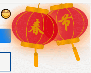
最近看到别人的网站上边都有一个小灯笼。感觉不错,分享一下,挂在网站上真喜庆。
预览图

<style>
	.deng-box {
		position: fixed;
		top: -40px;
		right: -20px;
		z-index: 9999;
		pointer-events: none;
	}

	.deng-box1 {
		position: fixed;
		top: -30px;
		right: 10px;
		z-index: 9999;
		pointer-events: none;
	}

	.deng-box1 .deng {
		position: relative;
		width: 120px;
		height: 90px;
		margin: 50px;
		background: #d8000f;
		background: rgba(216, 0, 15, 0.8);
		border-radius: 50% 50%;
		-webkit-transform-origin: 50% -100px;
		-webkit-animation: swing 5s infinite ease-in-out;
		box-shadow: -5px 5px 30px 4px rgba(252, 144, 61, 1);
	}

	.deng {
		position: relative;
		width: 120px;
		height: 90px;
		margin: 50px;
		background: #d8000f;
		background: rgba(216, 0, 15, 0.8);
		border-radius: 50% 50%;
		-webkit-transform-origin: 50% -100px;
		-webkit-animation: swing 3s infinite ease-in-out;
		box-shadow: -5px 5px 50px 4px rgba(250, 108, 0, 1);
	}

	.deng-a {
		width: 100px;
		height: 90px;
		background: #d8000f;
		background: rgba(216, 0, 15, 0.1);
		margin: 12px 8px 8px 10px;
		border-radius: 50% 50%;
		border: 2px solid #dc8f03;
	}

	.deng-b {
		width: 45px;
		height: 90px;
		background: #d8000f;
		background: rgba(216, 0, 15, 0.1);
		margin: -2px 8px 8px 26px;
		border-radius: 50% 50%;
		border: 2px solid #dc8f03;
	}

	.xian {
		position: absolute;
		top: -20px;
		left: 60px;
		width: 2px;
		height: 20px;
		background: #dc8f03;
	}

	.shui-a {
		position: relative;
		width: 5px;
		height: 20px;
		margin: -5px 0 0 59px;
		-webkit-animation: swing 4s infinite ease-in-out;
		-webkit-transform-origin: 50% -45px;
		background: #ffa500;
		border-radius: 0 0 5px 5px;
	}

	.shui-b {
		position: absolute;
		top: 14px;
		left: -2px;
		width: 10px;
		height: 10px;
		background: #dc8f03;
		border-radius: 50%;
	}

	.shui-c {
		position: absolute;
		top: 18px;
		left: -2px;
		width: 10px;
		height: 35px;
		background: #ffa500;
		border-radius: 0 0 0 5px;
	}

	.deng:before {
		position: absolute;
		top: -7px;
		left: 29px;
		height: 12px;
		width: 60px;
		content: " ";
		display: block;
		z-index: 999;
		border-radius: 5px 5px 0 0;
		border: solid 1px #dc8f03;
		background: #ffa500;
		background: linear-gradient(to right, #dc8f03, #ffa500, #dc8f03, #ffa500, #dc8f03);
	}

	.deng:after {
		position: absolute;
		bottom: -7px;
		left: 10px;
		height: 12px;
		width: 60px;
		content: " ";
		display: block;
		margin-left: 20px;
		border-radius: 0 0 5px 5px;
		border: solid 1px #dc8f03;
		background: #ffa500;
		background: linear-gradient(to right, #dc8f03, #ffa500, #dc8f03, #ffa500, #dc8f03);
	}

	.deng-t {
		font-family: 华文行楷, Arial, Lucida Grande, Tahoma, sans-serif;
		font-size: 3.2rem;
		color: #dc8f03;
		font-weight: bold;
		line-height: 85px;
		text-align: center;
	}

	.night .deng-t,
	.night .deng-box,
	.night .deng-box1 {
		background: transparent !important;
	}

	@-moz-keyframes swing {
		0% {
			-moz-transform: rotate(-10deg)
		}

		50% {
			-moz-transform: rotate(10deg)
		}

		100% {
			-moz-transform: rotate(-10deg)
		}
	}

	@-webkit-keyframes swing {
		0% {
			-webkit-transform: rotate(-10deg)
		}

		50% {
			-webkit-transform: rotate(10deg)
		}

		100% {
			-webkit-transform: rotate(-10deg)
		}
	}
</style>
<div th:fragment="lantern">

	<div class="deng-box denglong">
		<div class="deng">
			<div class="xian"></div>
			<div class="deng-a">
				<div class="deng-b">
					<div class="deng-t">节</div>
				</div>
			</div>
			<div class="shui shui-a">
				<div class="shui-c"></div>
				<div class="shui-b"></div>
			</div>
		</div>
	</div>

	<div class="deng-box1 denglong">
		<div class="deng">
			<div class="xian"></div>
			<div class="deng-a">
				<div class="deng-b">
					<div class="deng-t">春</div>
				</div>
			</div>
			<div class="shui shui-a">
				<div class="shui-c"></div>
				<div class="shui-b"></div>
			</div>
		</div>
	</div>

</div>
动图


